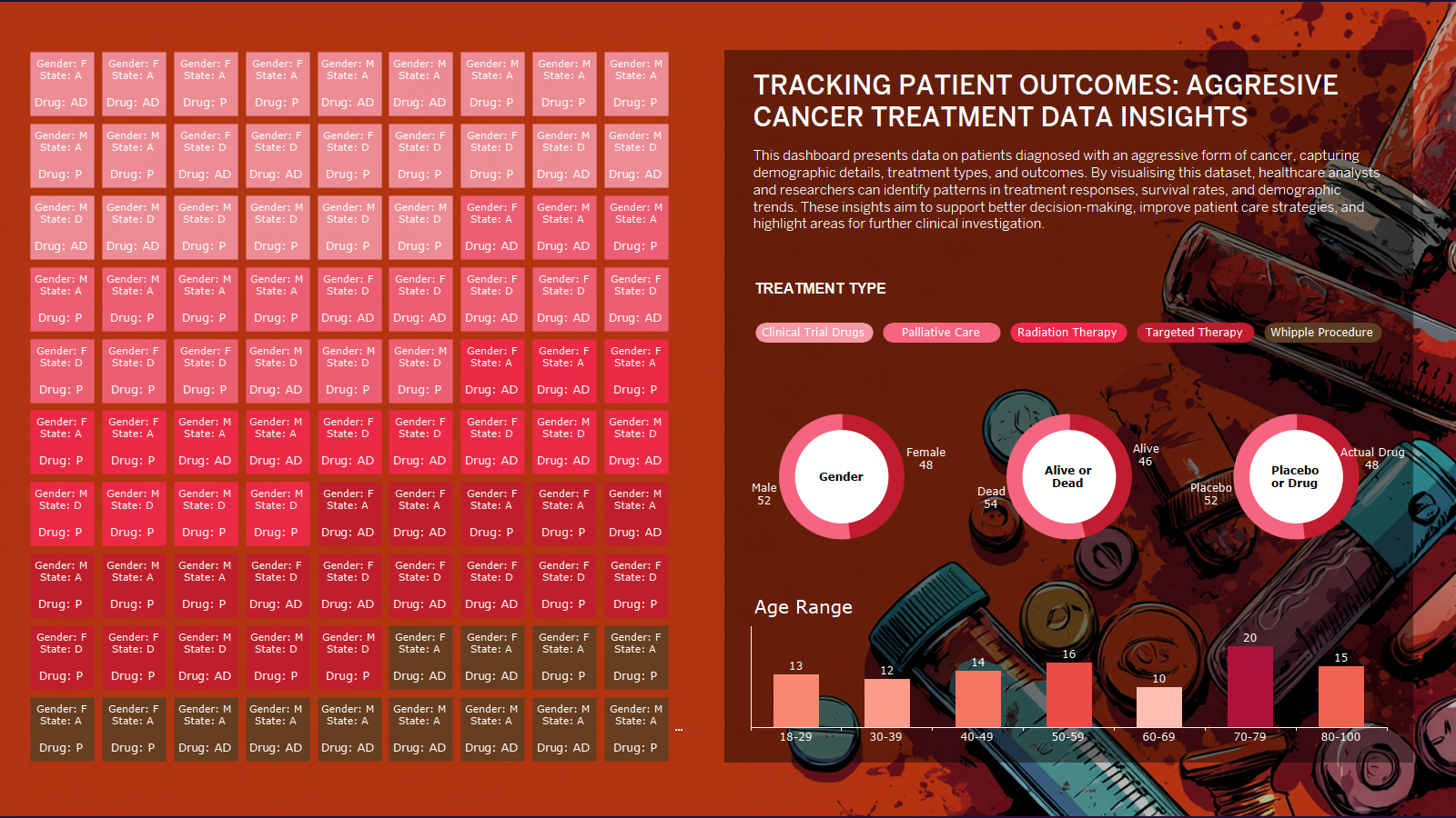
Coming From YouTube?

Download the working file instantly without signing up


What's Included

  • Interactive Dashboard: Build a self-serve dashboard for exploring healthcare data.

  • Pie Chart Filters: Use pie charts to filter data and uncover deeper insights.

  • Dashboard Actions: Apply dashboard actions to enable dynamic, user-driven analysis.

  • Treatment vs Outcome: Analyze connections between treatment types and patient outcomes.

  • Healthcare Insights: Provide tools for identifying patterns and driving better decisions.
  • Data Set

    The dataset contains cancer patient records, including gender, age range, treatment type, treatment response, survival outcomes, placebo use, treatment dates, and mortality status, designed for healthcare analysis and visualization purposes.

  • 🖼️ Collection of High-Resolution Images for Dashboards

    Access a curated collection of high-quality AI-generated images. Perfect for enhancing your dashboard designs, adding visual flair, or customizing your projects.

  • 📊 Complete Tableau Workbook Included

    Get the fully built Tableau workbook with dashboards. Study its structure, customize it, or add it to your portfolio to impress employers.

Full Project Life Cycle

From Data Inspection, to Data Analysis, Dashboard Creation and Tableau Online Publishing

Self-Serve Exploration
Users can interact with the dashboard to filter and analyze the data without needing technical skills.

Multiple Filter Options
Pie charts allow users to filter the dataset across various dimensions such as gender, treatment type, and outcomes.

Dynamic Dashboard Actions
Filters update the entire dashboard in real-time, providing instant, deeper insights through user interaction.

Treatment vs Outcome Focus
Easily investigate potential patterns or correlations between treatment types and patient survival or response.

Clear Visual Insights
The dashboard transforms complex healthcare data into simple, easy-to-understand visualizations for faster decision-making.


Course Curriculum

    1. Introduction and Design Steps

    2. Timeline 1 - Introduction

    3. Timeline 2 - Intro Steps

    4. Timeline 3 - Downloading and Loading Data

    5. Timeline 4 - Building the Pill

    6. Timeline 5 - Donut Charts

    7. Timeline 6 - Age Range

    8. Timeline 7 - Waffle Chart

    9. Timeline 8 - Adding all the Elements into your Dash

    10. Timeline 9 - Placing all the Elements

    11. Timeline 13 - Publishing to Tableau Cloud and Public

    12. Timeline 10 - Formatting Colours_ Spacing and Extra Donuts

    13. Timeline 11 - Final Styling and Background Image

About this course

  • 13 lessons
  • 1 hour of video content

Data Dictionary Included

📘 Why a Data Dictionary Matters:

A data dictionary is essential for understanding the structure and meaning of each field in your dataset. It ensures consistency, improves collaboration, and makes your analysis easier to follow—especially when sharing with employers or peers.